Tested on Xcode 13.4 with iOS 14
Button is one of the most fundamental building block for mobile apps. SwiftUI provides a very flexible way to create and customise buttons in your app.
Creating a Button
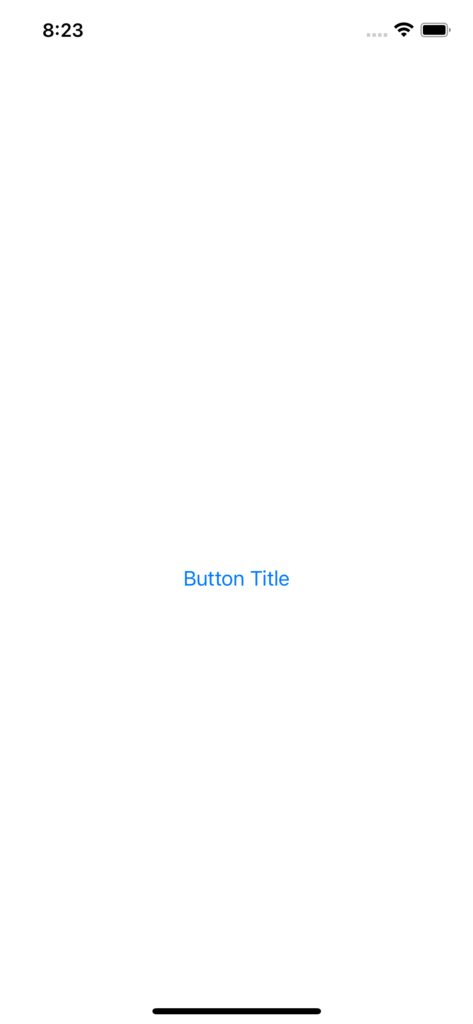
Button in SwiftUI can simply be created as below:
Button("Button Title") {
    // Action to perform on tap
}
This creates a button that simply consists of the text Button Title and performs the action specified in the closure.
You can create more complicated layout in the button as below:
Button {
    // Action to perform on tap
} label: {
    // Contents of the button
    HStack {
        Image(systemName: "command")
        Text("Button Title")
    }
}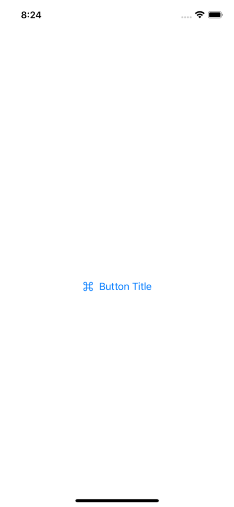
This still doesn’t look like much of a button though. We want to be able to specify more aspects of the button with things like background colour, foreground colour, border etc.
Customising a Button
SwiftUI provides .buttonStyle(_ style: ButtonStyle) method to allow us to define how the button should be styled. Lets create a custom style that we can apply to buttons for quick styling:
struct CustomButtonStyle: ButtonStyle {
    public let enabledBackgroundColor: Color
    public let disabledBackgroundColor: Color
    public let enabledForegroundColor: Color
    public let disabledForegroundColor: Color
    public let cornerRadius: CGFloat
    public let borderColor: Color?

    init(
        enabledBackgroundColor: Color,
        disabledBackgroundColor: Color,
        enabledForegroundColor: Color,
        disabledForegroundColor: Color,
        cornerRadius: CGFloat = 12.0,
        borderColor: Color? = nil
    ) {
        self.enabledBackgroundColor = enabledBackgroundColor
        self.disabledBackgroundColor = disabledBackgroundColor
        self.enabledForegroundColor = enabledForegroundColor
        self.disabledForegroundColor = disabledForegroundColor
        self.cornerRadius = cornerRadius
        self.borderColor = borderColor
    }

    @Environment(\.isEnabled) private var isEnabled

    func makeBody(configuration: Configuration) -> some View {
        configuration.label
            .font(.system(size: 18.0, weight: .semibold))
            .padding()
            .background(backgroundColor)
            .foregroundColor(foregroundColor)
            .cornerRadius(cornerRadius)
            .overlay(
                RoundedRectangle(cornerRadius: cornerRadius)
                    .stroke(
                        borderColor ?? .clear,
                        lineWidth: 1.0
                    )
            )
            .contentShape(RoundedRectangle(cornerRadius: cornerRadius))
    }

    var backgroundColor: Color {
        isEnabled ? enabledBackgroundColor : disabledBackgroundColor
    }

    var foregroundColor: Color {
        isEnabled ? enabledForegroundColor : disabledForegroundColor
    }
}
configuration.label in the makeBody method above is the content that is passed as the button’s body. Most of the modifiers above are self explanatory but lets have a quick look at each of them individually:
.font(.system(size: 18.0, weight: .semibold))applies system font with size 18.0 in semibold weight.padding()applies default padding to all 4 sides. This can be customised by passing explicit values for each side as needed.background(backgroundColor)applies background color to the button.foregroundColor(foregroundColor)applies foreground color to the button contents.cornerRadius(cornerRadius)applies the corner radius to the button.overlay()applies a RoundedRectangle border with border color and line width as specified- We could also add animation on button press using
configuratioin.isPressedvalue as needed
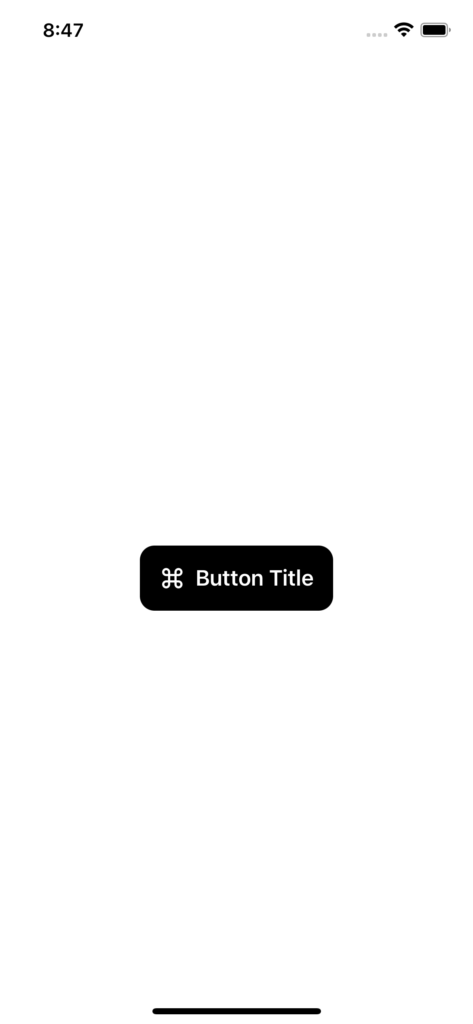
This style can be applied to any Button as below:
Button {
    // Action to perform on tap
} label: {
    // Contents of the button
    HStack {
        Image(systemName: "command")
        Text("Button Title")
    }
}
.buttonStyle(
    CustomButtonStyle(
        enabledBackgroundColor: .black,
        disabledBackgroundColor: .gray,
        enabledForegroundColor: .white,
        disabledForegroundColor: .white
    )
)
Code Cleanup
That looks much better but we can clean it up a little bit for improved reusability. Most apps have a handful of button styles that are reused through out the app so it would be great to have a way to apply the button style in a less verbose way:
extension ButtonStyle where Self == CustomButtonStyle {
    static var primaryButtonStyle: CustomButtonStyle {
        CustomButtonStyle(
            enabledBackgroundColor: .black,
            disabledBackgroundColor: .gray,
            enabledForegroundColor: .white,
            disabledForegroundColor: .white
        )
    }

    static var secondaryButtonStyle: CustomButtonStyle {
        CustomButtonStyle(
            enabledBackgroundColor: .clear,
            disabledBackgroundColor: .gray,
            enabledForegroundColor: .black,
            disabledForegroundColor: .white,
            borderColor: .black
        )
    }

    static var destructiveButtonStyle: CustomButtonStyle {
        CustomButtonStyle(
            enabledBackgroundColor: .red,
            disabledBackgroundColor: .gray,
            enabledForegroundColor: .white,
            disabledForegroundColor: .white
        )
    }

    static var primaryCircularStyle: CustomButtonStyle {
        CustomButtonStyle(
            enabledBackgroundColor: .black,
            disabledBackgroundColor: .gray,
            enabledForegroundColor: .white,
            disabledForegroundColor: .white,
            cornerRadius: 999
        )
    }
}
Now we can quickly apply these different styles as below to get the same effect as before:
Button {
    // Action to perform on tap
} label: {
    // Contents of the button
    HStack {
        Image(systemName: "command")
        Text("Button Title")
    }
}
.buttonStyle(.primaryButtonStyle)
That is a much cleaner call site. Most apps use a very explicit style of buttons through out the app so we can clean this up further.
struct CustomButton: View {
    let title: String?
    let icon: Image?
    let buttonStyle: CustomButtonStyle
    let action: () -> Void

    init(
        title: String? = nil,
        icon: Image? = nil,
        buttonStyle: CustomButtonStyle = .primaryButtonStyle,
        action: @escaping () -> Void
    ) {
        self.title = title
        self.icon = icon
        self.buttonStyle = buttonStyle
        self.action = action
    }

    var body: some View {
        Button(action: action) {
            HStack {
                icon

                if let title = title {
                    Text(title)
                }
            }
        }
        .buttonStyle(buttonStyle)
        .frame(minWidth: 40, minHeight: 40)
    }
}
And now the usage becomes even cleaner and consistent across the app:
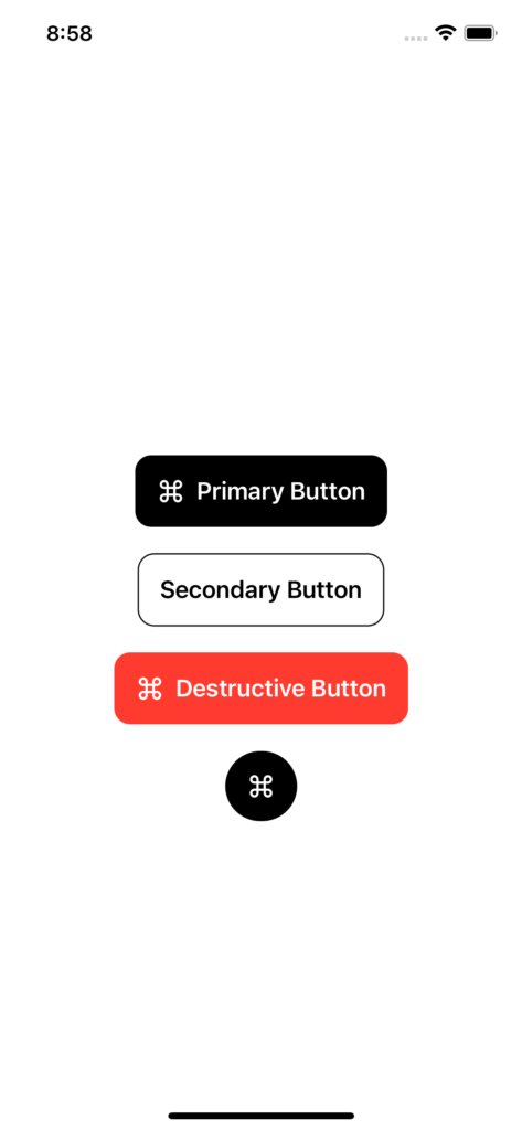
VStack(spacing: 20) {
    CustomButton(
        title: "Primary Button",
        icon: Image(systemName: "command"),
        buttonStyle: .primaryButtonStyle
    ) {
        // Do something
    }

    CustomButton(
        title: "Secondary Button",
        buttonStyle: .secondaryButtonStyle
    ) {
        // Do something
    }

    CustomButton(
        title: "Destructive Button",
        icon: Image(systemName: "command"),
        buttonStyle: .destructiveButtonStyle
    ) {
        // Do something
    }

    CustomButton(
        icon: Image(systemName: "command"),
        buttonStyle: .primaryCircularStyle
    ) {
        // Do something
    }
}
That is much cleaner to use now.
Bonus
Another advantage of styling buttons using ButtonStyle is that these button styles can be reused wiith NavigationLink to create navigation links that look exactly like rest of the buttons in your app
NavigationLink(
    "Button Title",
    destination: DetailsView()
)
.buttonStyle(.primaryButtonStyle)
Hopefully this provides a good understanding of not just how Buttons work in SwiftUI and how they can be styled but also provides a nice framework for how you can create a Button as a component. These can then be used easily through out the app and that provides a much consistent look and feel in your app.