SwiftUI provides the Shape protocol which allows developers to create any customs shape they want. It also provides 5 concrete shapes out of the box.
Built-in Shapes
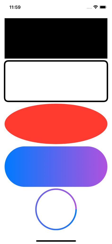
Lets start with the 5 shapes shipped in SwiftUI:
struct ContentView: View {
    var body: some View {
        VStack {
            Rectangle()

            RoundedRectangle(cornerRadius: 12, style: .continuous)
                .stroke(lineWidth: 5)

            Ellipse()
                .fill(.red)

            Capsule()
                .fill(gradient)

            Circle()
                .stroke(angularGradient, lineWidth: 5)
        }
        .padding()
    }

    var gradient: LinearGradient {
        LinearGradient(
            colors: [.blue, .purple],
            startPoint: .leading,
            endPoint: .trailing
        )
    }

    var angularGradient: AngularGradient {
        AngularGradient(
            colors: [.blue, .purple],
            center: .center
        )
    }
}
The important thing to note here are the configurable options and the default configurations that these shapes take on:
- By default, all shapes in SwiftUI are filled with the foreground colour. In the code example above, we specify nothing but Rectangle gets filled with the foreground colour by default
- For each shape we can choose between either filling the shape or stroking the shape as in the RoundedRectangle example above. Please note that the stroke colour defaults to foreground colour when it’s not explicitly specified
- You can specify a certain
Colorto be used to fill or stroke the shape as in the Ellipse example above where we filled it with red colour - The stroke and the fill methods take a ShapeStyle as input param which means that the methods are not limited to
Colorbut instead we can passGradientto it too. In the above example, we use gradients to fill the Capsule and stroke the Circle
Custom Shape
Shape protocol allows us to create custom shapes that we can use exactly as we used the built-in shapes above. The only thing required to fulfill the Shape protocol is to provide an implementation of func path(in rect: CGRect) -> Path which returns a Path that describes the shape we want to draw inside the passed in rect.
Checkmark
Let’s start with a very simple shape i.e. a checkmark as it only consists of 2 lines. Create a new file called Checkmark.swift as below:
import SwiftUI

struct Checkmark: Shape {
    let startPoint = CGPoint(x: 0.0, y: 0.5)
    let linePoints: [CGPoint] = [
        .init(x: 0.3, y: 1.0),
        .init(x: 1.0, y: 0.1)
    ]

    func path(in rect: CGRect) -> Path {
        let width = rect.size.width
        let height = rect.size.height

        var path = Path()
        path.move(
            to: .init(
                x: startPoint.x * width,
                y: startPoint.y * height
            )
        )

        for linePoint in linePoints {
            path.addLine(
                to: .init(
                    x: linePoint.x * width,
                    y: linePoint.y * height
                )
            )
        }
        return path
    }
}

struct Checkmark_Previews: PreviewProvider {
    static var previews: some View {
        VStack {
            Checkmark()
                .stroke(lineWidth: 10.0)
                .frame(width: 100, height: 100)
                .padding()

            Checkmark()
                .stroke(
                    style: .init(
                        lineWidth: 10.0,
                        lineCap: .round,
                        lineJoin: .round
                    )
                )
                .frame(width: 100, height: 100)
                .padding()
        }
    }
}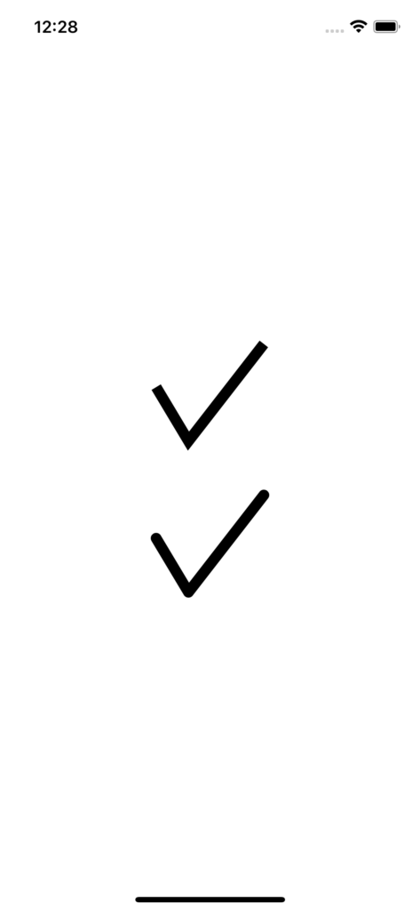
We first move to the point where we want to start drawing. The default starting point is (0, 0) i.e. top left. We move to the middle of leading edge above. Then we add 2 lines starting from that point. First one from middle of leading edge to the bottom edge and from there to almost to the top right corner of the rect. Note that we are taking into consideration the passed in rect so the shape will adapt to the frame the user may set on it. We have to set the Checkmark to be stroked explicitly because as we discussed in the last section that all shapes are filled by default.
Infinity
Let’s try to draw an infinity symbol which is only a tiny bit more complicated than checkmark. Create a new file called Infinity.swift and add the code below:
struct InfinitySegment {
    var toPoint: CGPoint
    var controlPoint: CGPoint
}

struct Infinity: Shape {

    var segments: [InfinitySegment] = [
        InfinitySegment(
            toPoint: .init(x: 1.0, y: 0.5),
            controlPoint: .init(x: 1.0, y: 0.0)
        ),
        InfinitySegment(
            toPoint: .init(x: 0.5, y: 0.5),
            controlPoint: .init(x: 1.0, y: 1.0)
        ),
        InfinitySegment(
            toPoint: .init(x: 0.0, y: 0.5),
            controlPoint: .init(x: 0.0, y: 0.0)
        ),
        InfinitySegment(
            toPoint: .init(x: 0.5, y: 0.5),
            controlPoint: .init(x: 0.0, y: 1.0)
        )
    ]

    func path(in rect: CGRect) -> Path {
        let width = rect.size.width
        let height = rect.size.height
        let center = CGPoint(x: 0.5 * width, y: 0.5 * height)

        var path = Path()
        path.move(to: center)

        for segment in segments {
            path.addQuadCurve(
                to: CGPoint(
                    x: segment.toPoint.x * width,
                    y: segment.toPoint.y * height
                ),
                control: CGPoint(
                    x: segment.controlPoint.x * width,
                    y: segment.controlPoint.y * height
                )
            )
        }

        return path
    }
}


struct Inifinity_Previews: PreviewProvider {
    static var previews: some View {
        VStack {
            Infinity()
                .stroke(Color.black, lineWidth: 10.0)
                .frame(height: 300)
                .padding()

            Infinity()
                .fill(
                    LinearGradient(
                        colors: [.blue, .purple],
                        startPoint: .top,
                        endPoint: .bottom
                    )
                )
        }
    }
}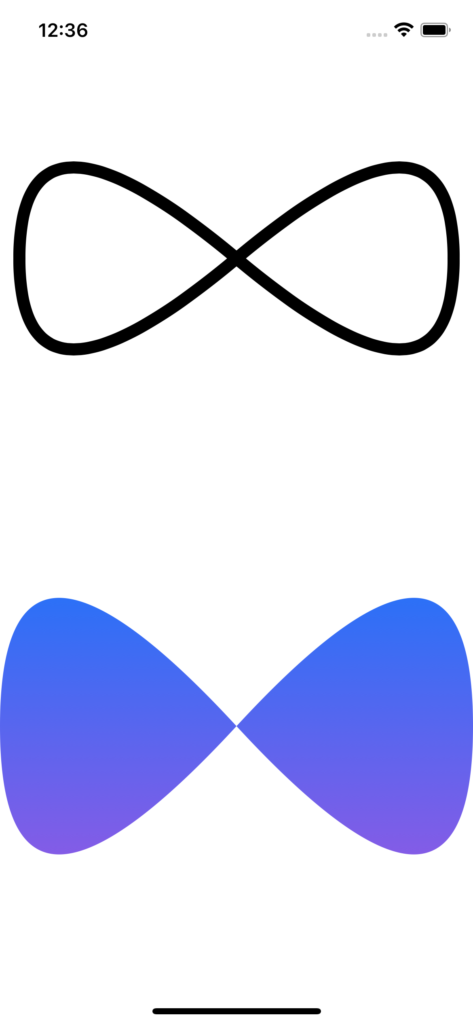
We start drawing at the centre of the rect and then add 4 quad curves from centre to middle of trailing edge, back to centre, from centre to middle of leading edge and back to centre again. Quad curves require a control point that dictates the shape of the curve. The curve does not actually touch the control point, it impacts the shape of the curve by pulling the curve towards control point. The control points we use here are in the 4 corners. It is a good exercise to play with these data points to learn the impact of these values on the resulting shape